Responsive Web Design with HTML5 and CSS 3rd Edition
Since 2012, ’ Responsive Web Design with HTML5 and CSS ’ by Ben Frain , has been Packt publishing’s best-selling book on Responsive Web Design. Now there's a completely updated 3rd Edition for 2020 and beyond!
What's new in the 3rd Edition?300+ Info Packed Pages
Media queries, SVG, animations, CSS tranforms, accessibiltity, Flexbox, CSS Grid, CSS Scroll Snap and much, much more.
Sample Code
Chapter code is available for each subject and you also get the code for this site which utlitises many of the techniques you'll master throughout.
Latest Edition
The 3rd Edition of Packt’s best-selling Responsive Web Design title since 2012. Updated in 2020 to include all the essential CSS and HTML features.
Is it for you?
Are you a full-stack developer who needs to gem up on their front-end skills? Perhaps you work on the front-end and you need a definitive overview of all modern HTML and CSS has to offer?
Maybe you have done a little website building but you need a deep understanding of responsive web designs and how to achieve them? This is a book for you!
What will you learn
CSS media queries to apply different styles to different device classes. Load different images depending upon screen size or resolution. Write clean, semantic and accessible HTML markup. Work with SVGs to provide resolution-independent images.
The latest features of CSS: Custom Properties, variable fonts and CSS Grid.
Reviews
-
Get up to speed on the modern, professional way to build websites with HTML & CSS
-
What I like the most about this book, are the explanations of the web standards, so that every lay person can understand how to make use of them.
-
...easy to follow and could be referenced and the findings implemented whilst building my responsive site.
New in the 3rd Edition
If you’ve only read the 1st Edition, there’s no question you’ll learn plenty more from the 3rd Edition.
However, if you have the 2nd edition, you may be wondering if it’s worth your while.
Here’s a selection of the new topics covered in the 3rd Edition:
- Huge chapter on CSS Grid
- CSS Scroll Snap
- CSS mix-blend modes
- Variable fonts
- CSS font loading techniques
- CSS clip-path
- CSS custom properties
- CSS environment variables (A.K.A. phone notches)

Mailing List
Full Chapter List
-
Essentials of Responsive Design
By the end of this first chapter, you will have made a responsive web page. Along the way you will have gained the understanding of where Responsive Web Design came from, the problems it solves and the core tenants of implementing a Responsive Web Design with HTML and CSS.
-
Writing HTML markup
Good HTML markup is the basis for any good web site or application. More importantly, HTML provides a bedrock of understanding for assisitve technology. In this chapter we cover everything from the opening
<!DOCTYPE html>to the closing tag. -
Media Queries
Media queries provide the means to target CSS not just on screen width, but screen height, color preference, screen density (DPI) and a whole lot more. We'll also look at CSS4 media queries like hover and pointer size (to target mouse and touch).
-
Fluid layout, Flexbox and Responsive Images
Flexbox is the most widely supported modern CSS layout system. Once we have covered the syntax and use cases of Flexbox, we get our hands dirty with Flexbox; using it to layout sections of this very site. This chapter also covers responsive images; allowing you to provide any number of image permutations for the target device.
-
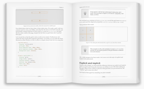
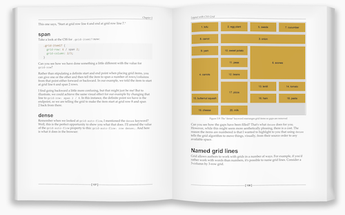
Layout with Grid
CSS Grid is the first 2 dimensional layout system for the web. New in this edition is a whole chapter dedicated to understanding the capabilities and efficiencies of CSS Grid.
Understanding CSS Grid might just be the single biggest upgrade you can give your CSS skills!
-
CSS selectors, typography, color modes and more
This is a dense and varied chapter covering topics such as how CSS selectors work, dealing with typography using
@font-faceand variable fonts, understanding HEX, RGBA and HSLA color modes plus a whole bunch of extra topics such as text-truncation, multi-column layout, CSS calc and environment variables. Oh and more besides. Phew! -
Stunning Aesthetics with CSS
Another chapter bursting with CSS goodness. Want to know about text and box shadows? What about multiple backgrounds and linear and radial gradients? Repeating gradients? CSS filters like blur and sepia? Masks and Clipping? Mix-blend modes? It's all in here. And more besides!
-
SVG: Scalable Vector Graphics
SVGs are an essential part of a responsive developers toolkit. We cover the most practical use-cases for SVG; how to insert SVGs directly into markup, inside an object element, as a background image and standard image. We also cover creating an SVG sprite sheet, and how SVGs can be animated and optimisied for use on the web.
-
Transitions, Transformations and Animations
Transitions, transformations and animations, when used judiciously, can really bring a design to life. In this chapter we cover all three. Plenty of examples, with downloadable code are provided so you can play about with the techniques for yourself.
-
Forms
This chapter covers everything you are likely to need to know about forms. Topics include accessible form structure, the various elements of forms, form validation and the most recent CSS that allows better control of form visuals than ever before. Oh, and lots of handy attributes to make the right keyboard appear on iOS and Android devices too!
-
Bonus techniques and parting advice
In the final chapter we will bring together all the knowledge learned so far and consider how best to approach a responsive project. We also consider some best-practice techniques to get your responsive HTML and CSS based projects off to the best possible start. And just like 'Q' in James Bond, I won't let you leave without a few extra special techniques to help you in the field.